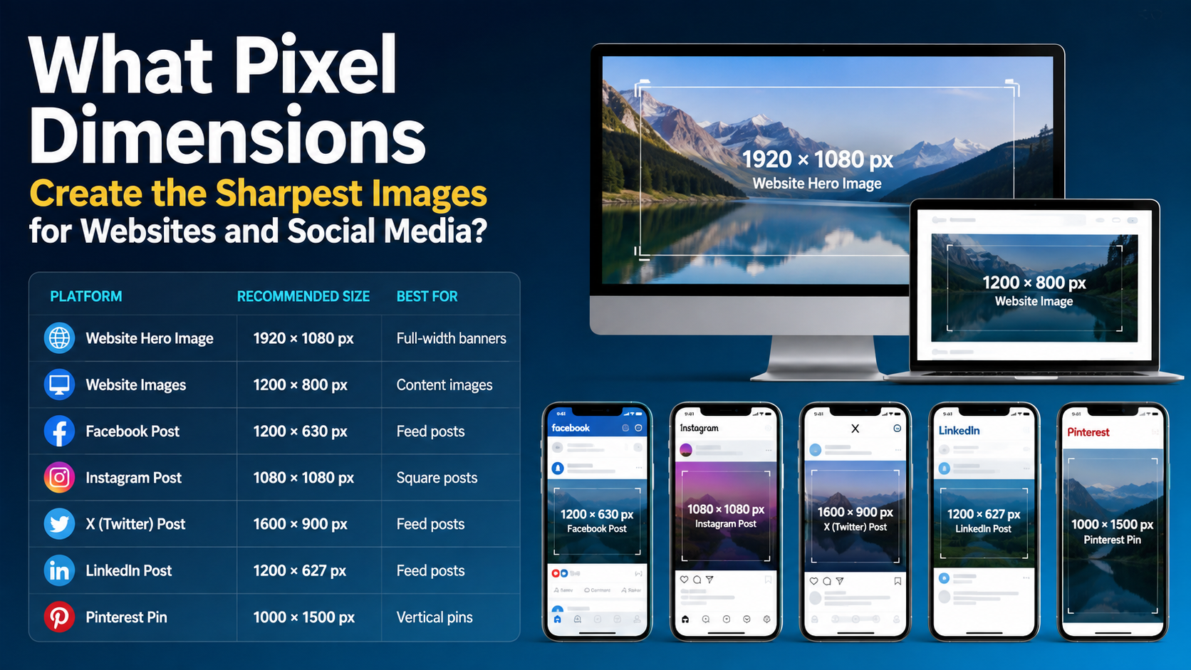
Sharp images are created by matching pixel dimensions to the space where an image will appear. The best image dimensions for sharp images are large enough for the display area—often about twice its CSS width for high-density screens—without sending unnecessarily huge files.
For Indian websites, online shops, local-business listings and social channels, this means preparing images for specific placements rather than exporting one oversized file for everything. This guide explains practical pixel sizes, aspect ratios, compression settings and responsive techniques for clear images that also load quickly.
Key Takeaways
- Use pixels, not DPI, to prepare images for screens.
- For websites, export at approximately 1× to 2× the rendered CSS width, then serve responsive variants.
- Instagram accepts photos from 320 to 1,080 pixels wide when the aspect ratio is between 1.91:1 and 3:4.
- LinkedIn recommends at least 1,080 pixels wide for shared photos and supports ratios from 3:1 to 4:5.
- YouTube recommends 3,840 × 2,160 thumbnails for videos, with a 16:9 ratio.
- Google Business Profile recommends 720 × 720-pixel photos, with a 250 × 250 minimum.
- Correct cropping, sharpening, export quality and compression matter as much as dimensions.
Pixels, Resolution and Sharpness: What They Mean
A pixel is one picture element in a digital image. A file that is 1,200 × 800 pixels contains 960,000 pixels. More pixels can preserve more detail, but only when the original image is sharp and the platform displays that detail.
"Resolution" is often used ambiguously. For websites and social media, pixel dimensions are the practical specification. DPI (dots per inch) mainly matters for printing; changing an image from 72 to 300 DPI without changing its pixel dimensions does not make it sharper on a phone or monitor.
Sharpness depends on several factors:
- Intrinsic dimensions: The number of pixels in the file.
- Displayed size: How large the image appears in CSS pixels or on a social platform.
- Device pixel ratio (DPR): A phone may use two or three physical pixels for one CSS pixel.
- Resizing and cropping: Enlarging a small image causes softness; aggressive crops remove detail.
- Compression and format: Excessive JPEG compression creates blockiness and ringing around text.
A useful web rule is to provide an image close to the display width and a 2× version for high-density screens. The browser can select the appropriate file with srcset and sizes; MDN explains that these attributes let browsers choose among image resolutions based on layout and device density (MDN responsive images).
Best Pixel Dimensions for Website Images
There is no universal website size because a logo, blog image and full-width hero occupy different spaces. First measure the image's rendered width in your layout.
Practical website sizing guide
| Website use | Typical rendered width | Suggested export dimensions |
|---|---|---|
| Small icon or thumbnail | 150-300 px | 300-600 px wide |
| Blog card or product tile | 300-450 px | 600-900 px wide |
| Main article image | 700-900 px | 1,400-1,800 px wide |
| Desktop content image | 1,000-1,200 px | 2,000-2,400 px wide |
| Full-width banner | 1,440-1,920 px | 2,880-3,840 px wide |
| Retina logo or UI graphic | 200-400 CSS px | 400-800 px wide |
These are starting points, not mandatory standards. If your content column is 760 CSS pixels wide, a 1,520-pixel source is a sensible 2× option. Do not upload a 6,000-pixel photograph when the largest display is 900 pixels unless users need zoom or cropping.
Always include explicit width and height attributes (or an equivalent aspect-ratio rule). web.dev notes that known dimensions allow the browser to reserve space and reduce layout shifts (web.dev responsive images).
Example responsive markup
`html
<img
src="product-800.webp"
srcset="
product-400.webp 400w,
product-800.webp 800w,
product-1600.webp 1600w
"
sizes="(max-width: 600px) 100vw, 760px"
width="1600"
height="1200"
alt="Blue cotton kurta displayed on a mannequin"
loading="lazy">
`
The sizes value should reflect the actual layout. An incorrect value can make the browser download an image that is too small—or unnecessarily large.
Recommended Social Media Dimensions
Social networks resize and compress uploads. Starting with the correct aspect ratio prevents unwanted cropping and keeps text, faces and logos inside the visible frame.
Instagram's Help Centre states that photos between 320 and 1,080 pixels wide retain their original resolution when the aspect ratio is between 1.91:1 and 3:4 (Instagram image resolution guidance).
Practical working files are:
- Square feed post: 1,080 × 1,080 pixels (1:1)
- Portrait feed post: 1,080 × 1,350 pixels (4:5)
- Tallest supported photo ratio: 1,080 × 1,440 pixels (3:4)
- Stories and Reels canvas: 1,080 × 1,920 pixels (9:16)
Keep important text away from the top and bottom of a Story or Reel, where interface controls and captions may cover the design. For carousels, use one consistent ratio for every slide to avoid unexpected cropping.
LinkedIn requires shared photos to be at least 552 × 276 pixels and recommends 1,080 pixels wide. Its accepted aspect-ratio range is 3:1 to 4:5; images outside that range are cropped (LinkedIn photo requirements).
Useful exports include:
- Landscape link or post image: 1,200 × 627 pixels (approximately 1.91:1)
- Square post: 1,080 × 1,080 pixels
- Portrait post: 1,080 × 1,350 pixels (4:5)
For website link previews, LinkedIn specifies a minimum of 1,200 × 627 pixels and a maximum of 7,680 × 4,320 pixels (LinkedIn sharing image requirements).
YouTube
YouTube recommends custom video thumbnails at 3,840 × 2,160 pixels in a 16:9 ratio, with a minimum width of 640 pixels. It accepts formats such as JPG and PNG and applies upload-size limits that differ between mobile and desktop (YouTube thumbnail guidance).
Design thumbnails so the title remains readable at small mobile sizes. Large dimensions cannot rescue tiny type, low contrast or a blurry source frame.
X
For X advertising, the official creative specifications recommend:
- Square image: 1,200 × 1,200 pixels
- Landscape image: 1,200 × 628 pixels (approximately 1.91:1)
See the X Ads creative specifications. For a profile header, X recommends 1,500 × 500 pixels, although cropping can vary across screens (X profile customization guidance).
Google Business Profile
For local businesses in India, Google Business Profile is important for Maps and Search visibility. Google recommends JPG or PNG photos between 10 KB and 5 MB, at 720 × 720 pixels, with a minimum of 250 × 250 pixels (Google Business Profile photo guidelines).
Use well-lit, in-focus photographs that represent the real premises, products and team. Over-sharpened or heavily filtered images may look unnatural and fail to communicate what customers will actually find.
Choose the Right Aspect Ratio Before Exporting
Aspect ratio is the relationship between width and height. A 1,080 × 1,350 image is 4:5; a 1,920 × 1,080 image is 16:9.
Create a crop for the final placement instead of stretching one image into every format:
- 1:1: Catalog tiles, profile graphics and square posts
- 4:5 or 3:4: Mobile feed portraits
- 16:9: YouTube thumbnails, website video banners and presentations
- 9:16: Stories, Shorts and Reels
- 1.91:1: Link previews and wide social graphics
Place faces, product labels and calls to action inside a central safe area. Preview the design on an actual phone before publishing, particularly when text is close to an edge.
File Format and Compression Affect Perceived Sharpness
Dimensions determine how much detail is available; export settings determine how much survives delivery.
JPEG
Use JPEG for photographs and gradients. Export a quality setting around 75-85 as a starting point, then inspect fine text, hair and fabric. Repeatedly opening and saving a JPEG can compound artifacts, so keep a high-quality master file.
PNG
PNG is suitable for logos, screenshots, illustrations and transparency. It can be much heavier than JPEG for photographs. Facebook's Help Centre warns that PNG files larger than 1 MB may appear pixelated in some upload situations (Facebook photo troubleshooting); test the final upload rather than assuming PNG is always superior.
WebP and AVIF
Modern websites can often use WebP or AVIF for smaller files while retaining good visual quality. Keep a fallback when supporting older tools or workflows, and confirm that your content-management system generates the intended format.
Before publishing, check:
- File size on a mobile connection
- Text at 100% zoom
- Fine edges and diagonal lines
- Colour shifts after conversion
- Cropping on both desktop and mobile
A Reliable Workflow for Sharp Images
- Identify the placement. Record the container width, ratio and whether the image can be cropped.
- Crop first. Set the final ratio before resizing.
- Resize to the target pixels. Avoid enlarging beyond the original's useful detail.
- Apply output sharpening. Use moderate sharpening after resizing; excessive halos make images look artificial.
- Convert and compress. Choose JPEG, PNG, WebP or AVIF according to the content.
- Add metadata and accessibility. Use descriptive filenames and meaningful alt text on websites.
- Preview the upload. Platforms may recompress or crop even technically correct files.
- Keep a master. Export new versions from the original rather than from an already compressed copy.
Common Mistakes That Make Images Look Blurry
- Uploading a screenshot or a thumbnail instead of the original.
- Enlarging a 600-pixel image to 1,500 pixels.
- Using a 9:16 design in a 4:5 feed placement without checking the crop.
- Saving text-heavy graphics as low-quality JPEGs.
- Relying on DPI settings instead of pixel dimensions.
- Uploading massive originals without responsive variants, slowing the page.
- Applying sharpening before a major resize, which can create jagged edges.
- Ignoring colour profiles and seeing unexpected saturation or contrast after upload.
Frequently Asked Questions
Is 1,080 pixels enough for social media?
For many feed posts, yes. Instagram's documented maximum width for retaining original resolution is 1,080 pixels, while LinkedIn recommends 1,080 pixels wide for shared photos. Use larger masters when you expect future crops, but export the platform version at its recommended dimensions.
Should website images be 72 or 300 DPI?
DPI does not determine screen sharpness. Set the pixel dimensions required by the layout, then compress the file appropriately. DPI metadata can remain unchanged without affecting browser display.
Are bigger images always sharper?
No. A larger file can contain more detail, but an out-of-focus or heavily compressed original remains poor. Oversized files also increase download time. Match the source to the display size and provide responsive alternatives.
What dimensions should an Indian small business use?
For a practical starter set, prepare 1,080 × 1,080 and 1,080 × 1,350 social posts, 1,080 × 1,920 Story/Reel creatives, 1,200 × 627 link-preview graphics and 720 × 720 Google Business Profile photos. Adjust these when a platform's current upload screen specifies a different ratio.
How can I stop text from becoming fuzzy?
Use large, high-contrast type, export at the final pixel dimensions, avoid repeated JPEG saves and inspect the uploaded preview. For logos and flat graphics, PNG or a modern lossless/near-lossless format usually preserves edges better than a low-quality JPEG.
Conclusion
The best image dimensions for sharp images depend on the destination, displayed size and crop—not on one universal "high-resolution" number. Use the correct aspect ratio, export enough pixels for high-density screens, compress thoughtfully and let responsive HTML serve the appropriate version to each device.
For your next website or social campaign, create a small, organised export set for each placement, test it on an Indian mobile connection and review the live result before publishing. That process delivers cleaner visuals, faster pages and more professional-looking content.